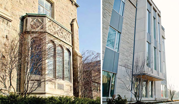
Debut of the West Wing
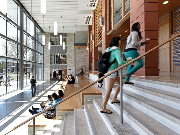
After years of planning, excavation and construction, the west wing of Goodes Hall officially ‘opened for business’ on September 15. Just five days before, the fall term had commenced and business students of all programs wasted no time in staking their claim on the Goodes Commons, the centerpiece of the new addition, pictured above. After figuring out the new building-wide room numbering system, students soon snapped up every available break-out and meeting room. New, tech-enabled classrooms have proven equally popular, and the ever-present line-ups at the in-house Starbucks attest to its appeal.
“Goodes Hall is a source of pride for our students,” says ComSoc President Nicola Plummer, Comm’13. “The new wing gives us much needed space to work, but also to live and play—the ultimate home away from home!”
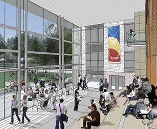 An early architectural rendering
As described in previous issues of QSB Magazine, the new wing was built to accommodate program growth, including a 40% rise in Commerce enrollment in the last five years. This fall, 450 students entered the program; 5,360 had applied. Dean David Saunders explained in his message in the Summer 2012 issue: “Business education, like business itself, has become increasingly global. In order to compete, growth is not a ‘nice to do,’ it’s a ‘must do’.” Even with the growth of the Commerce program, the acceptance ratio of one in 10 applicants remains unchanged from 10 years ago. The introduction of new programs, such as the Master of Finance and soon-to-launch Master of Management Analytics, was also putting pressure on existing facilities.
The excavation and construction phases certainly posed some operational challenges. Renovations and lack of space in the original building required a move of many staff to either Dunning Hall or off-campus to an office building near Hwy. 401. For those left behind, ear plugs were available on request to help reduce the noise from drilling and blasting. Little wonder there was a universal sigh of relief from students, faculty and staff when renovations in the original building and the construction of the new wing were completed. Finally, all were back under one roof again, just in time for the start of the fall term.
Alumni and donors who attended the official opening festivities during the School’s Reunion Weekend in September got an up-close-and-personal look at the new west wing. Responses varied from “Wow!” to “It sure beats Dunning Hall!” The latter came from QSB alumni who graduated prior to 2002, most of them splitting their class time between Dunning and Mackintosh-Corry Halls. For those unable to attend the official opening or visit subsequently, this is a primer on the new, expanded Goodes Hall. It’s not just about the building; it’s also about how the building is already improving the learning experience of our students.
The Architecture
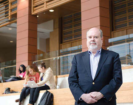 Architect Peter Berton in the Goodes Commons with Kinnear classroom doors closed on the level above.
Peter Berton of Toronto’s Ventin Group (+VG Architects) was the principal architect of both the original Goodes Hall and the new west wing. “We must have done something right the first time,” he says of the firm’s design of the original Goodes Hall, “since the University chose us to design the expansion.”
For Peter and fellow Ventin architects Nicole Crabtree and Chris Hall, the new wing offered a welcome chance to build upon some of the design innovations they introduced in the original building. “We didn’t want to simply mimic the design of Phase I.” (Phase I, the original Goodes Hall that opened in 2002, incorporated a modern east wing addition to the restored 1892 Victoria School.) “Repeating that wouldn’t have met the School’s needs since the operational requirements of both spaces were distinct,” he explains.
“The whole idea of building onto a historic structure is to have it maintain its prominence,” says principal architect Peter Berton. “You do not want to overshadow it. Nor should the new build-on just parrot the old building. What makes for a beautiful result is the contrast between the two.”
A tour of the building with the architect uncovered the stories behind some of his favourite design elements.
The Goodes Commons
The Inspiration: The Pit, in Carleton University’s architecture building, where Peter hung out as a student in the late ‘70s. “It was the place for students to congregate when I was at Carleton,” Peter recalls. “The amphitheatre design gave it maximum flexibility as a study space—a spot to have a coffee and read the paper—as well as an event space. It was in the middle of the building, so it was quite dark. I always wondered what a similar space would be like in natural light.” His design of the Goodes Commons finally provided an answer: it would be beautiful.
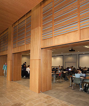 Students take over the Kinnear Classroom to study for exams.
Design Challenge: One of the design strategies in the University’s campus master plan is to reveal Queen’s “community” culture and to facilitate more interaction and cross-pollination of ideas across faculties. “Creating a solid wall of glass on the façade facing Union Street opened the building up, enabling people inside to see out and those outside to see in,” Peter explains. Its welcoming appearance encourages passers-by to come in and have a look around. Locating the main feature at street level also grounded the building. “It no longer looks as though the building is raised up, which is how the original Victoria School building appears since it’s a half-level above grade.”
Vision vs. Reality: The architects’ initial artistic rendering of the space shows students congregating on the steps, studying and interacting with each other. “You never really know how a space will end up being utilized,” Peter muses. “It turns out the Commons is being used exactly as we’d foreseen.” On the first day that Commerce students began arriving in numbers, he was emailed a photo of the Goodes Commons by Steve Millan, BCom’89, QSB’s Executive Director of Finance, Administration and Operations and Peter’s principal contact on the project. “It was so close to the rendering that I asked Steve if he’d staged it!” Peter laughs. “He assured me he’d just snapped a photo of the space in action.”
There’s a completely different vibe to the Commons when it’s compared to the heart of the original building, the BMO Atrium. Usually, the Commons is almost eerily quiet. Students tend to be engrossed in their laptop screens or reading their textbooks. When they talk with classmates, their voices are often hushed, even when they’re in line at Starbucks. Contrast these muted tones with the sound level in the Atrium, which is often a beehive of activity. It’s a traffic corridor when classes end and students stream in and out of the large lecture theatres located along the east wall. There’s usually a table or two with students selling baked goods for a worthy cause or encouraging classmates to sign up for a conference or competition. Plans are made, coursework is reviewed, and the chatter is often exuberant. For those looking for some peace and quiet, there’s now a spot designed just for them, just around the corner in the new wing.
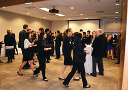 The Kinnear Classroom in action for the Dean’s Commerce Awards reception in November.
It’s a classroom, it’s an event room—it’s both!
By day, it’s the Kinnear Classroom, so named in recognition of the generosity of donors Paul (BCom’63) and Tom (BCom’66, LLD’02) Kinnear. There are no tiers or fixed seating. Tables and chairs are configured as required for lectures or presentations. By night (and sometimes during the day, too), the walls facing the corridor overlooking the Commons are retracted, opening up the room to serve as an event space. For extra-large gatherings, crowds can spill out from the classroom, down to the Commons and even out the doors to the front lawn. Since nature abhors a vacuum, students regularly take over the space to study or hold impromptu meetings whenever the room isn’t otherwise occupied.
How green is our building?
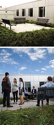 The green roof, a favourite retreat
Pretty green, it turns out. It incorporates Leadership in Energy and Environmental Design (LEED) certified design features. LEED is a third-party certification program and an internationally accepted benchmark for the design, construction and operation of high performance green buildings. In the case of the new wing, these features include a ‘green’ roof (pictured) with plantings that absorb rainwater,provide insulation and a habitat for wildlife, and l The water fountain that tracks consumption Lower the urban air temperature. The use of high energy-efficiency components (windows, HVAC, light fixtures) and environmentally friendly materials such as Forest Stewardship Council certified wood products, and the recycling of excavated rock and soil, ticked other LEED check-boxes. Fountains (pictured) track water consumption and provide instant feedback on the number of plastic bottles that would otherwise have ended up in landfill sites (89,928 in the first three months).
The Cool Stuff
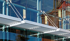
No SAD syndrome here! An exterior brise-soleil (sun shade) that runs the length of the Commons’ glass wall is angled to provide maximum sunlight in winter, when it’s often in short supply. In the spring and summer, it offers maximum shade so that the interior space doesn’t become overheated.
Bay windows bookend each side of the west and east wings of Goodes Hall: on the east side, they’re crescent shaped; on the west, rectangular. They’re a modern twist on the traditional bay windows of Gordon Hall and the John Deutsch University Centre buildings just down the street in the heart of the campus.
Imported building blocks. Although Kingston’s nickname is “The Limestone City,” mass quantities of that admirable local rock had been depleted by the 1950s. From that point on, the University had to truck in Queenston limestone for new buildings and facades. With those quarries now over-mined, too, general contractor Atlas Corporation’s hunt for the most cost-effective deal took staff all the way to Indiana (still within LEED’s prescribed 500 mile radius for transporting materials).
Check out the video that features highlights of the new wing at qsb.ca/thankyou
